Earthquakes are...
Goals here: 1) Demonstrate that it is possible to plot gobs of data on a single chart. 2) Show that useful information can be quickly derived by same, without needing to delve into extensive data analysis. 3) Make really cool pictures. 4) Get rich. (this last one is optional, but I won't object if a few dollars found there way into my pocket from this).
Latest example -- a delta map tiled onto a globe
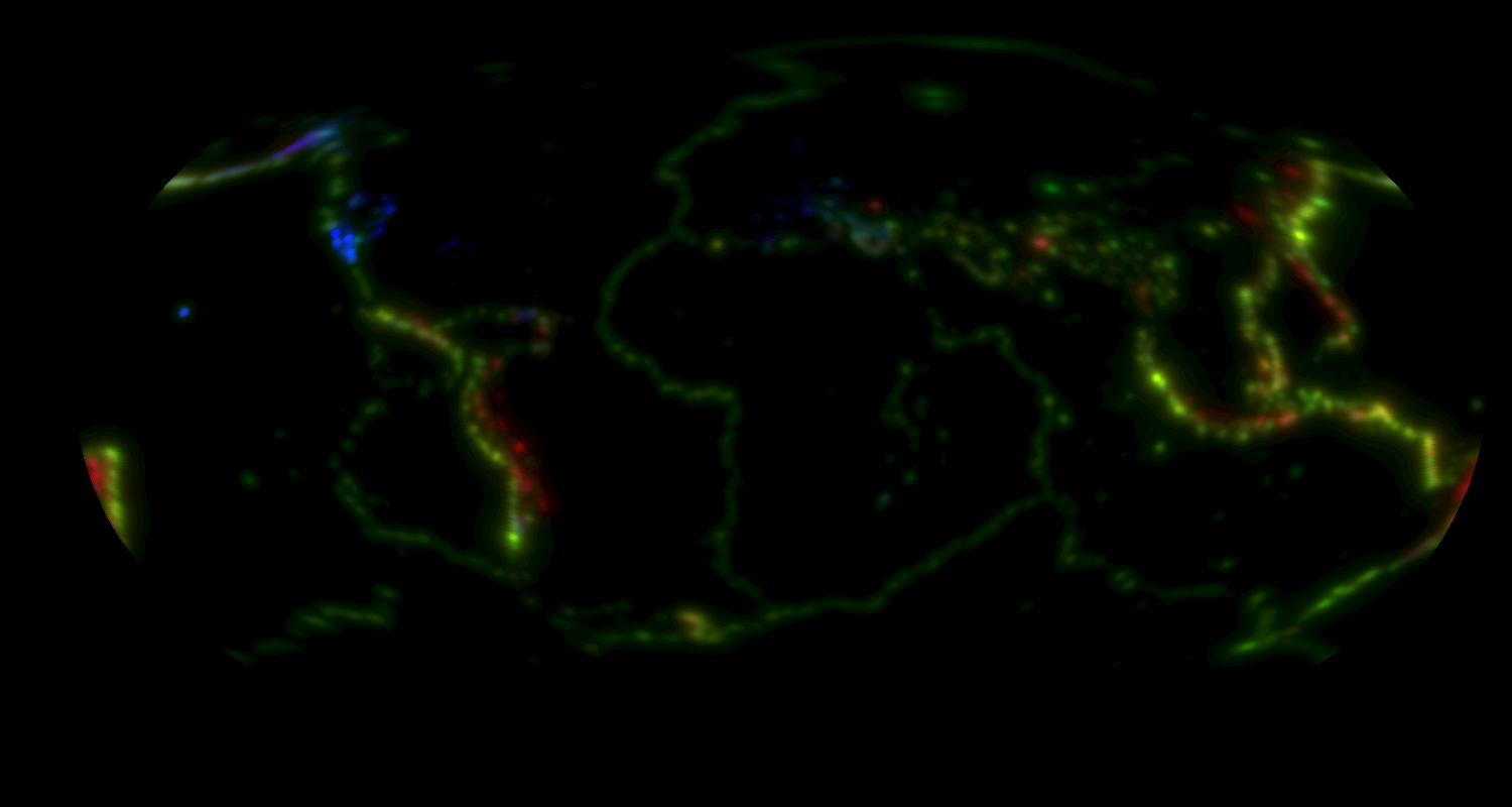
 A first effort. This plots data going back about 5 years, covering roughly 500,000 data points. No refinement of the display was done, the colors are pretty much ad-hoc (I believe red is under 10km depth, green is under 50km, and blue is everything else.. I think), and while I was importing half a million data points, a discrepancy in the data that my import was unprepared for caused it to kick out a good two-thirds of the data as 'bad'. Even so, you can get a rough idea of where the ring of fire is, and make out a few other items of interest. You may notice the coordinate system I'm using isn't the standard 360 degrees in a circle kind of system... I'm using -1 for 180W and 90S, and 1 for 180E and 90N.
 A second effort. This plots data going back to 1970, but while the import flaw was still in effect, so you are looking at only about one-million data-points.
I took time out to adjust the color effect to better limit the shading to points closer to the actual quakes. Given more data points, I can safely reduce it... the point of this style of plotting data is not to make individual rows of data visible, but to make trends in the data visible.
I've also taken the opportunity to refine the colors: Green = shallow, red = deep, blue was actually trying to flag a particular condition (volume of quakes), but given it's focusing on Alaska, the west coast of America, and Europe, I suspect it's picked up on a data artifact and instead highlighted that very nicely. In short I suspect the sensitivity for small quakes there is higher (just perusing the data I've seen quakes with magnitudes of 0.5), so they record in higher volume, and come up as blue. I plan to combat this later by filtering out small quakes from the data prior to plotting it.
As with the original plot, the coordinate system is still -1 to 1.
A second effort. This plots data going back to 1970, but while the import flaw was still in effect, so you are looking at only about one-million data-points.
I took time out to adjust the color effect to better limit the shading to points closer to the actual quakes. Given more data points, I can safely reduce it... the point of this style of plotting data is not to make individual rows of data visible, but to make trends in the data visible.
I've also taken the opportunity to refine the colors: Green = shallow, red = deep, blue was actually trying to flag a particular condition (volume of quakes), but given it's focusing on Alaska, the west coast of America, and Europe, I suspect it's picked up on a data artifact and instead highlighted that very nicely. In short I suspect the sensitivity for small quakes there is higher (just perusing the data I've seen quakes with magnitudes of 0.5), so they record in higher volume, and come up as blue. I plan to combat this later by filtering out small quakes from the data prior to plotting it.
As with the original plot, the coordinate system is still -1 to 1.
 A third effort. This is where I'd spotted the import flaw and fixed it. Some rows are getting rejected, but it is actually plotting about two and a half million rows of data, covering data from 1970 and forward. This also maps the results using a Kavrayskiy VII projection. I still need to render continents (finding simple + good data for this has prooved difficult... some "simple" data I found was ONLY 1 gigabyte in size...). I also need to re-add grid-lines, but for the moment the continents take precedence. I plan to take a high-resolution map of the earth, extract the land-mass edges, and plot that onto the result.
While I've not found a great data-source for this, I found one that should prove acceptable.
A third effort. This is where I'd spotted the import flaw and fixed it. Some rows are getting rejected, but it is actually plotting about two and a half million rows of data, covering data from 1970 and forward. This also maps the results using a Kavrayskiy VII projection. I still need to render continents (finding simple + good data for this has prooved difficult... some "simple" data I found was ONLY 1 gigabyte in size...). I also need to re-add grid-lines, but for the moment the continents take precedence. I plan to take a high-resolution map of the earth, extract the land-mass edges, and plot that onto the result.
While I've not found a great data-source for this, I found one that should prove acceptable.
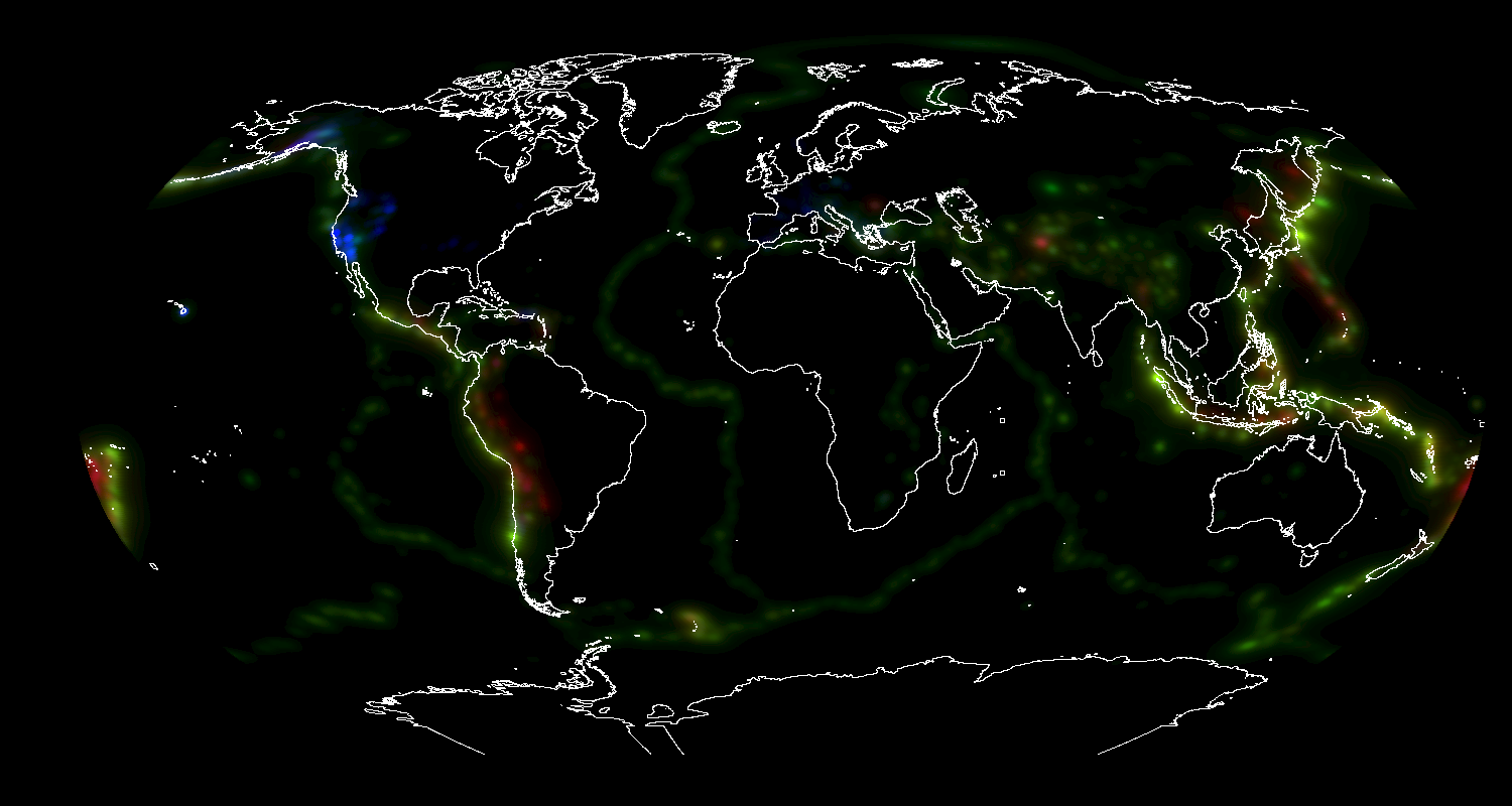
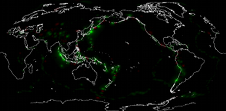
 A fourth effort. This takes the previous map and adds continents. The data is less than perfect, but it appears to mostly line up with the earthquake data I am plotting (Greenland seems off, but a dozen other points I checked were at/near spot-on). Still needs for grid-lines, but with the continents drawn, I've got most of the framework already added, and the grid-lines become less vital.
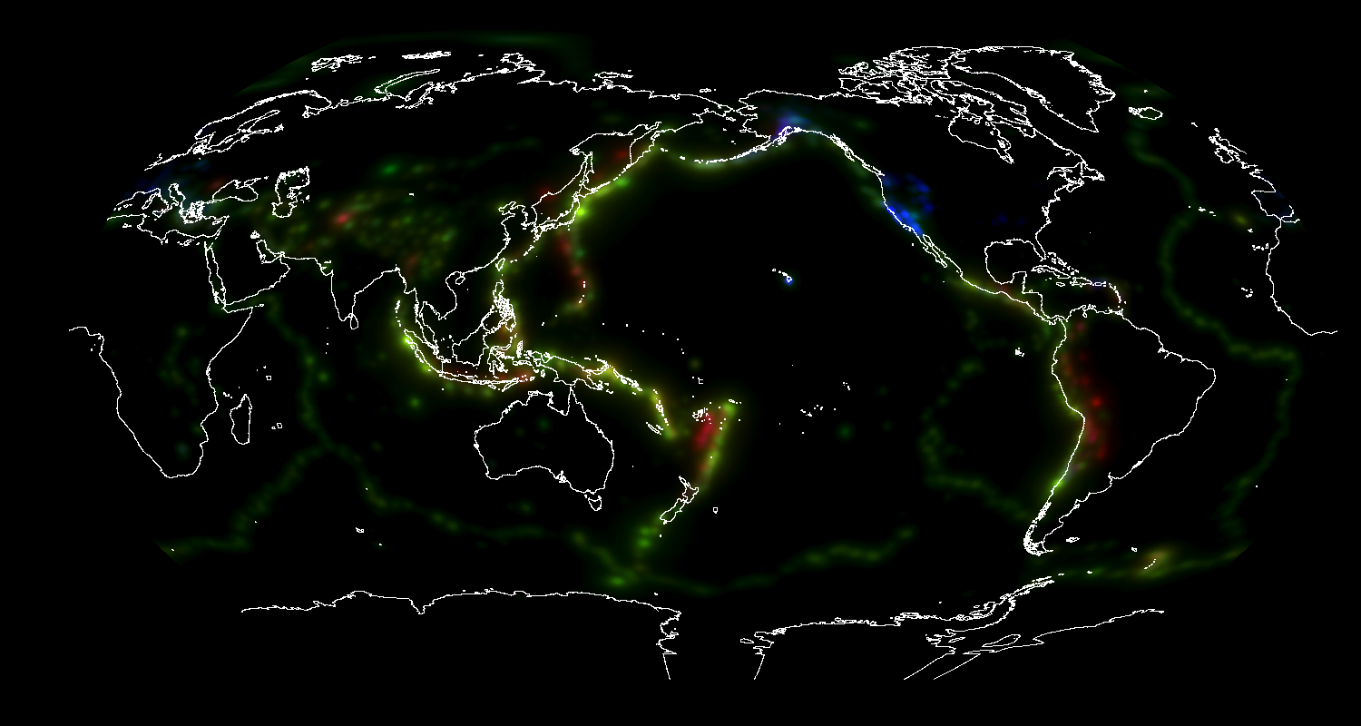
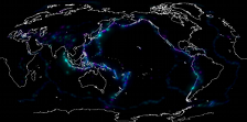
 A fifth effort. This corrects a problem in the gamma calculation. The effect is subtle, but I feel important. I've also taken time to tweak some of the more subtle render options. Other (more obvious) changes include adding support for rotating the image around the poles, thus allowing me to feature the Pacific ocean. Adding this support involved tracking down and fixing several minor bugs with rendering at the edges. I still need to recalibrate the continents (they will be off by up to one pixel until I do this), so this makes a good chance to patch up a few of the larger flaws (ahem, antartica, ahem).
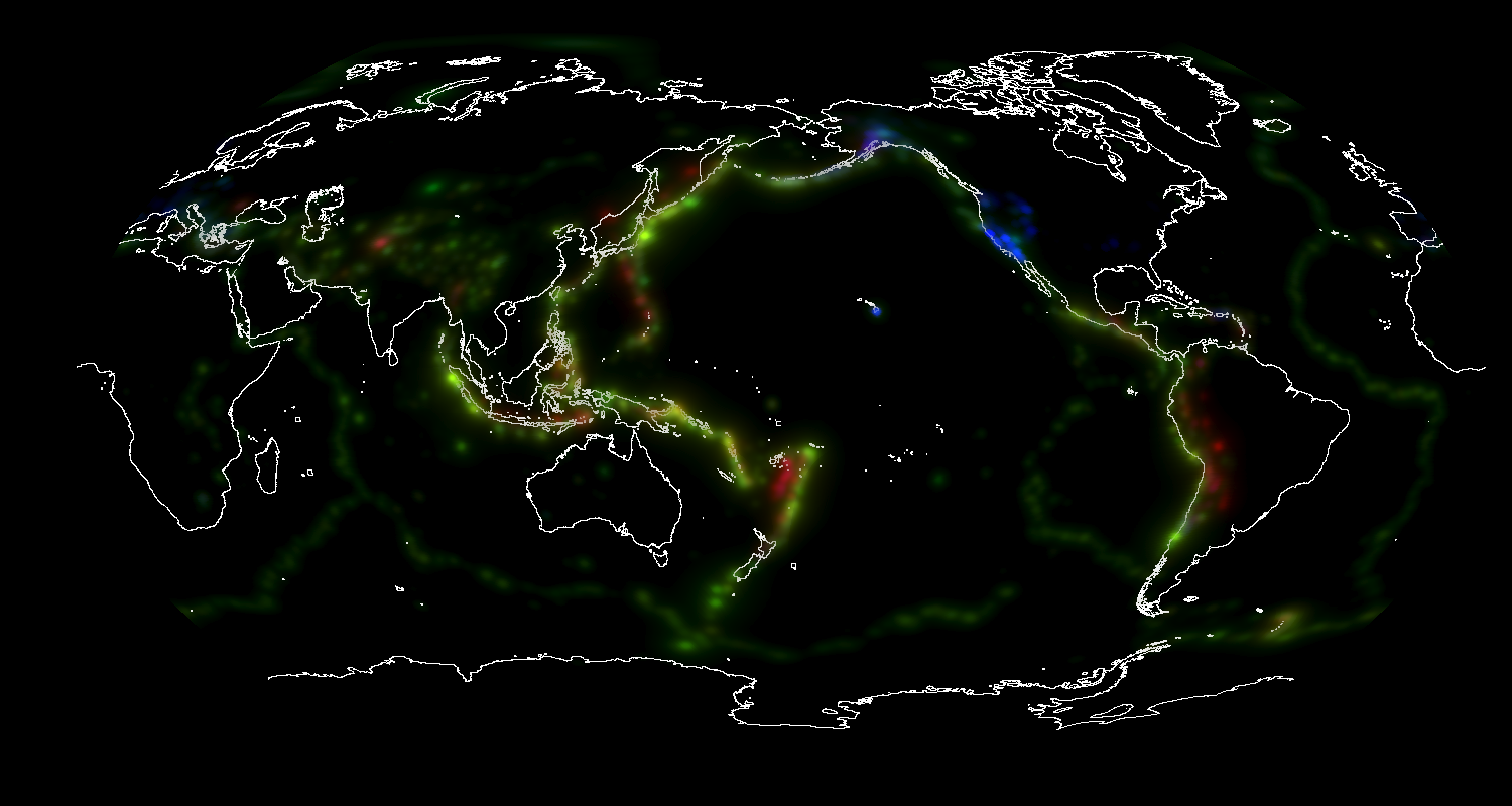
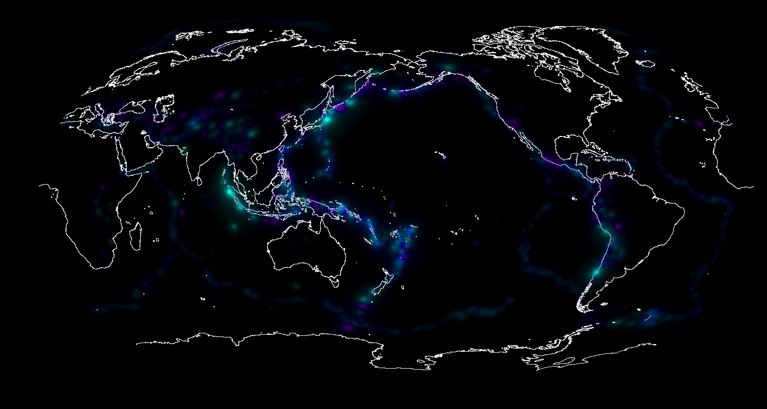
 A (for now) final effort.The map data has been recalibrated, although to do a proper job of it it looks like I'll need to tilt it's pole so that England moves South and Japan moves North... not something I'm currently capable of. For now however, 4 points on the ring of fire are close and one more is off by only 1-2 pixels. I did take the opportunity to patch some holes in Antartica, and adjusted the map overlay to try and have it present as more of an 'underlay'. The brighter the color at the location, the less the map's 'white' shows through. I may tune that setting some later.
Next up will be a different style of map. I've worked with straight 'delta' plots in the past, but they present a couple shortcomings (such as showing where change occurs but not where value exists). I hope to have a substantially improved delta plot to show, in the form of a (cruder than crude gets) crude predictive plot for Earthquakes. IMPORTANT NOTE: The upcoming "predictive" plot is more to show how the plot can highlight kinds of data, it is not geared for accurate prediction of earthquakes! If it says "No risk of earthquake in japan" and you move there only to have one topple your house, don't come blaming me! -- At best, earthquake prediction is guesswork. Educated guesswork, but still guesswork.
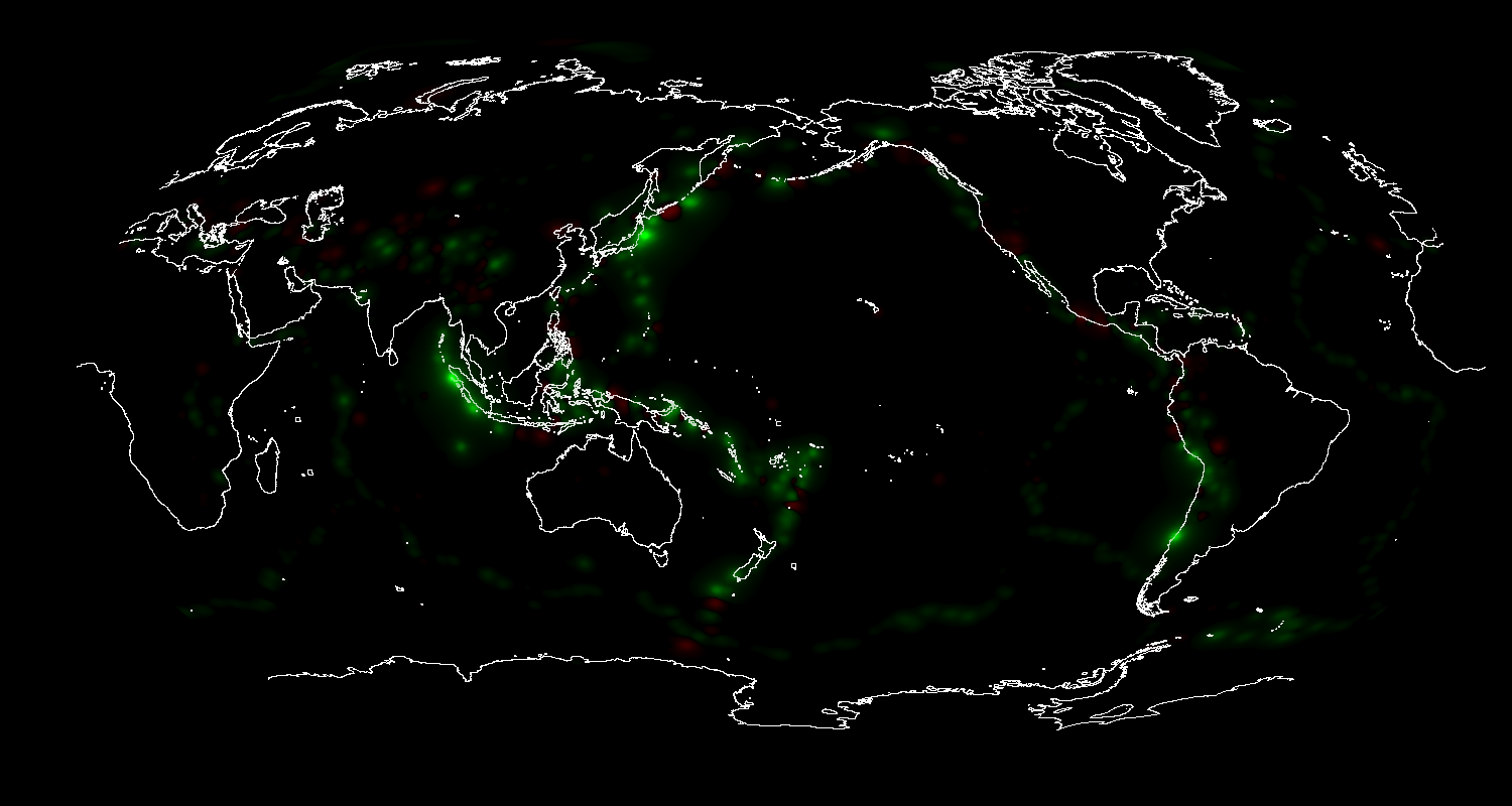
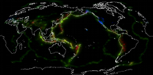
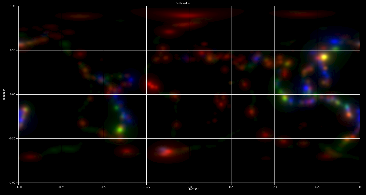
 A first delta. Using 3 color channels here to represent the data. Blue is used for the overall quake energy release (1970-present). Without the blue channel.Red is used for energy release prior to 2000, green is for energy release after January 1, 2000. The twist is that red and green are mutually subtractive, and weighed so that the shorter time-span carries a larger weight. Were I to use this tool to predict earthquakes, I'd suggest that the places in darker shades of Magenta (strong red + strong blue) are places to be wary of.
Globes
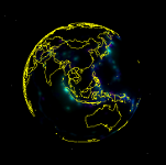 A first globe A second globe This just applies the map data to the globe by way of Google Earth. Looks like my raw export includes those nasty off-by-one errors again, so I'll have to again verify the source of the error before fixing it. I boosted the resolution some for these, but I'm going to either have to address memory issues, or render the image in pieces, both of which have concerns (total available memory won't manage the size I want, and splitting it presents a (admitiedly simple) problem with the brightness calculation, as it scales the brightness according to the value for the brightest point.... plus then pieceing the smaller bits together). THen there's the issue where I *think* Google Earth is futzing some with the resolution I gave it. I'm going to see if I can pass the map in as tiles with different resolutions for different zoom factors. I see already two ways to do that, but both have shortcomings (exceeding the limits the API supports, and what may be a licensing based limitation). Things to do, things to research. I think I'll be occupied for some time.
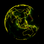
A tiled globe. This globe implements tiling -- this lets me build maps to much greater resolution without concern for memory (disk and CPU are different matters...). Tiles are 256x256, this globe implements them 5 deep, for a final resolution of 8kx8k, better than 4x the pixels in the previous globe. On cpu: This builds the image one tile at a time. Tiles of the highest tier are then combined and have the resolution reduced to generate the lower-tier images -- This constituted a *major* rewrite of the logic that draws the image, plus new logic for generating tiles and more logic to generate the necessary KML files. For performance, the program can & will build multiple tiles in parallel, but its still a multi-hour operation to generate tiles for the 8kx8k image.
A tiled delta-globe.A tiled delta-globe without the blue channel. These better highlight why tiling was implemented -- with just glowing dots, zooming wasn't really an issue. Here you get discrete borders between areas, which may have detail at any level. Again rendered to only 5 levels, for once I'd like to add a 6th level (netting a 16kx16k image) but skipped on it for now (disk space on my web host may not be unlimited...). I think its time I reached out to find data that is better suited to demonstrating this tool, just not sure yet what to reach for. One thought is to focus on US-specific data and convert zip-codes to lat/longitude, which would open up the kinds of data I can plot... decisions, decisions.
I've picked out 2010 census data for my next target.
Torrenal
 A first effort. This plots data going back about 5 years, covering roughly 500,000 data points. No refinement of the display was done, the colors are pretty much ad-hoc (I believe red is under 10km depth, green is under 50km, and blue is everything else.. I think), and while I was importing half a million data points, a discrepancy in the data that my import was unprepared for caused it to kick out a good two-thirds of the data as 'bad'. Even so, you can get a rough idea of where the ring of fire is, and make out a few other items of interest. You may notice the coordinate system I'm using isn't the standard 360 degrees in a circle kind of system... I'm using -1 for 180W and 90S, and 1 for 180E and 90N.